Spreadsheet with formulas
This lab uses a spreadsheet to simulate 3 growth processes and will also give you an introduction to some of Excel’s tools. If there is time, you’ll also experiment with randomness.
The 3 models are increasingly complicated, requiring various parameters to determine their behavior.
Run Excel and zoom (perhaps to 150% ) in order to easily see your work.
The table above is a guide to what you’ll put at the top of your spreadsheet and will be a template for the cells that follow. The numbers are parameters that will determine the behavior of the various models and the text identifies either the parameters to the right or the data below.
You can format the cells using the alignments and significant figures as I’ve done, but this isn’t important for now.
Begin by typing (or copying) the data from the 7 cells of the first column of the table above into to your spreadsheet (ignore the rest of the table for the moment).
Select the 2 cells containing 0 and 1 and carefully move your pointer to the lower-right corner of the selection until a little solid plus sign + appears, then left-click and drag your pointer down to cell A70. This should fill in the time identifier for each of the periods.
![]() From Microsoft Excel Help: You can copy formulas into adjacent cells by using the fill handle, the small black square in the lower-right corner of the selection: When you point to the fill handle, the pointer changes to a black cross. Select the cell that contains the formula, and then drag the fill handle over the range you want to fill.
From Microsoft Excel Help: You can copy formulas into adjacent cells by using the fill handle, the small black square in the lower-right corner of the selection: When you point to the fill handle, the pointer changes to a black cross. Select the cell that contains the formula, and then drag the fill handle over the range you want to fill.
This first column might represent days or years, etc. Although this column is itself a linear growth model (starting at 0 and increasing by 1 each period), we use it as a time identifier and fill in the next columns with simulated data.
The very simplest ‘growth’ model is just a constant value, which in a time series (TS) plot would be a horizontal line. The next simplest is a linear model that grows by a constant increment each time period.
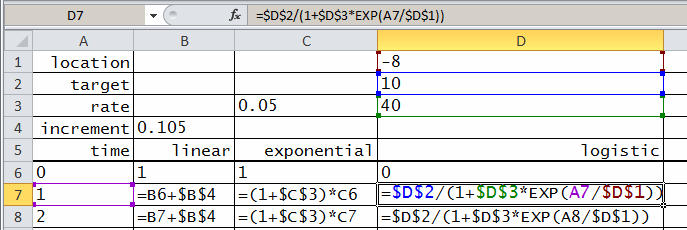
Study the second column of the table above. The first non-empty cell is the increment, the second is label for the linear model, the third cell is the initial value at time 0, and the fourth cells a formula that specifies how subsequent cells will be computed.
Type or copy the first 4 non-empty cells of the second column of the above table into the corresponding locations in your spreadsheet. Note the first 3 cells will appear unchanged but that after you enter the formula in cell A7 it will be replaced with its value. You can see the formula by selecting the cell and you can always toggle viewing the any of the formulas by pressing CTRL + ` (grave accent). Try it.
In a linear model the value at time = t is equal to the value of that of the previous period plus some increment:
zt+1 = zt + c
This ‘index’ could represent years, days, seconds, or any regularly-spaced increment.
We shall examine several models for 64 time steps, beginning ‘now’ at time = 0. Using the select-and-copy technique introduced above, copy cell B7 down into the range next to the time identifiers. Because the formula has ‘relative’ references each of the cells represents the value of the cell above it plus the increment.
Return the initial and increment values to those in the table at the beginning of the lab.
Excel provides a large suite of plotting tools, the basic design of which are excellent (though some of the more elaborate ones are hideous). We use a line ‘chart’ to plot the data.
Select all the cells in the second column from the label linear to the last number in the range, then click the chart wizard and follow the steps:
1. From the ‘ribbon’ select Insert > charts > line > 2D line > sub-type: line (upper left thumbnail), which places a blank plot area in the spreadsheet.
2. Right-click the plot area > select data > range and click on the icon then select the linear data range, including its name linear (from A6 to A70), then click OK.
3. I like to clean up the plot by changing the title, reformatting the axes, etc…
4. Select Next and Finish to put the chart on your worksheet where you can see it.
Save the spreadsheet as growth.xls.
The next growth model is exponential, in which the value in each period is a multiple of the prior period, with a parameter determining the rate of growth (or decline):
zt+1 = (1 + r) ´ zt
Copy or type the cells from the third column of the table above into the corresponding positions in your spreadsheet then copy the formula down through the remaining empty cells for each time period.
Select all of the model values and format them with 2 decimal places
Again, the easiest way to visualize the behavior of this model is with a chart.
On the plot you made earlier, right-click > Select Data > Series: Add, Name: click the button then select the exponential label of the third column. Select Values: and select all the numerical values in the exponential column and then OK twice.
You should now see two curves in your chart, showing very different temporal behavior. The linear model has a constant increment but that of the exponential starts out slowly and is even less than the linear but eventually overtakes it.
Again, experiment with the 2 parameters of this model. Note how sensitive the growth is to the rate parameter.
As before, fill in the cells from the fourth logistic column of your spreadsheet from the table above and copy the formula from cell D7 through the time periods.
This model is even more complex. As its value increases the exponent in the denominator approaches 0 so that the denominator approaches 1 and the value approaches the target g:

Plot these data in the same plot area you created for the others.
This third model is capable of more complicated behavior than any we’ve seen so far, Yet again its value around time = 30 is similar to that of the others.
All of the models so far are deterministic in the sense that each value follows completely predictably from the prior value. In fact, each value could be calculated without reference to the prior value
In this final optional step you’ll simulate random values to give your models a realistic appearance.
First you’ll compute a random variable, in this case normally distributed with mean 0 and standard deviation 1.
In the label cell of the fifth column (next to logistic) type the text variate and in the cell below type the formula
=NORMINV(RAND(),0,1)
then copy it down through the empty cells.
NOTE: You can also use Data > Data Analysis > Random Number Generation to compute sets of simulated data. An advantage of this technique is that it gives a fixed set rather than one that changes with each modification of the spreadsheet.
The variate column can be regarded as a perturbation term in any of the growth models.
In the label cell of the sixth (F) column (next to variate) type the text random and in the cell below type the formula =B6+E6 so that you’re adding the variate to the linear model.
Then graph this new series on your chart and discuss.
Because your random variable is NORMAL(0,1), what should you expect to get for values of the mean _____, minimum _____, maximum _____, and standard deviation _____ of your simulation?
Use Tools > Data Analysis > Descriptive Statistics to compute these statistics and compare with your expectations.
You have simulated 3 growth models and (perhaps) added a random variate to the simulations.
Consider the applicability of these various models to real-world phenomena especially in economics and ecology.
Write a few “Data to Insight” sentences to summarize what you’ve learned about: